
Data Explorer
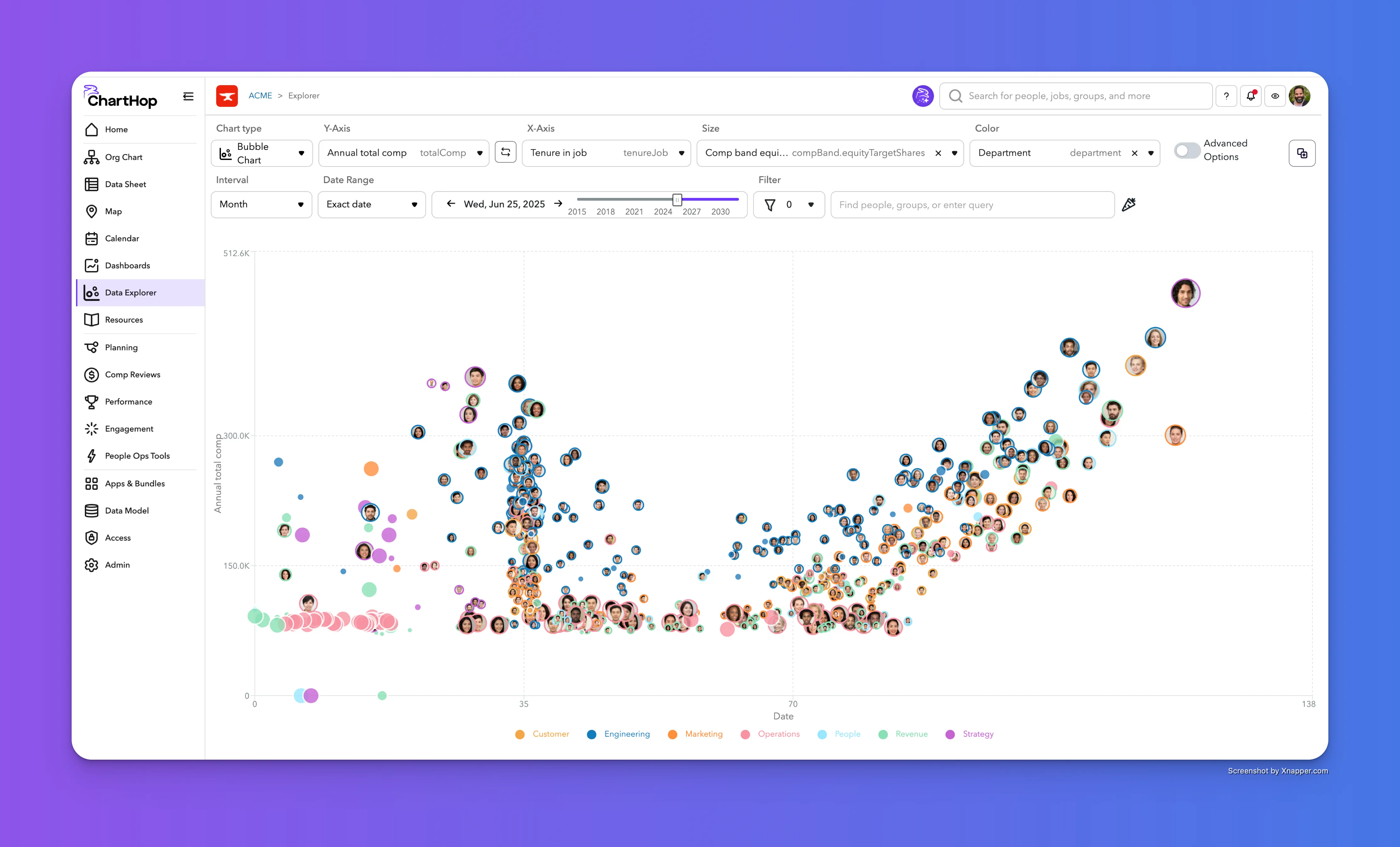
Data Explorer
Data Explorer is a new way to explore data in ChartHop with a full screen experience and interactive options to choose fields, categories, date range, and filters. Data Explorer is a powerful way to gain insights quickly.
To access Data Explorer, first ensure that it is active in the account and the desired User is selected for access. It is recommended to enable this for only users that have access to team or department data as Users with no direct reports and no Admin access will not find the charts very useful. Once it is enabled, Data Explorer is found in the primary left Menu sidebar, appearing below Dashboards.
Timeseries Chart Types
Area Chart
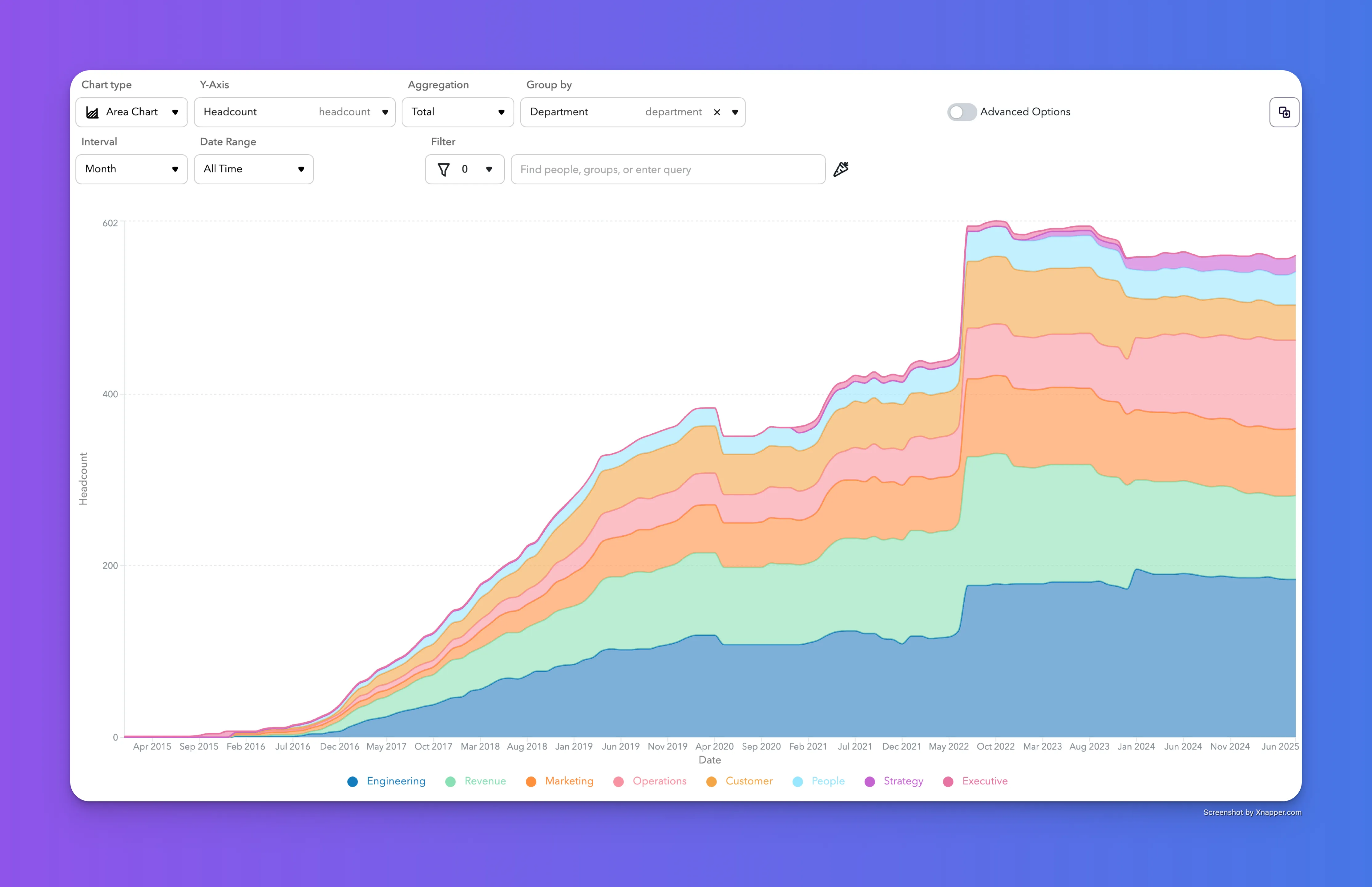
Area charts show how values change over time, with shaded regions that help highlight trends, patterns, and cumulative totals. They're ideal for tracking growth, comparing categories, and visualizing part-to-whole relationships in your data.
Line Chart
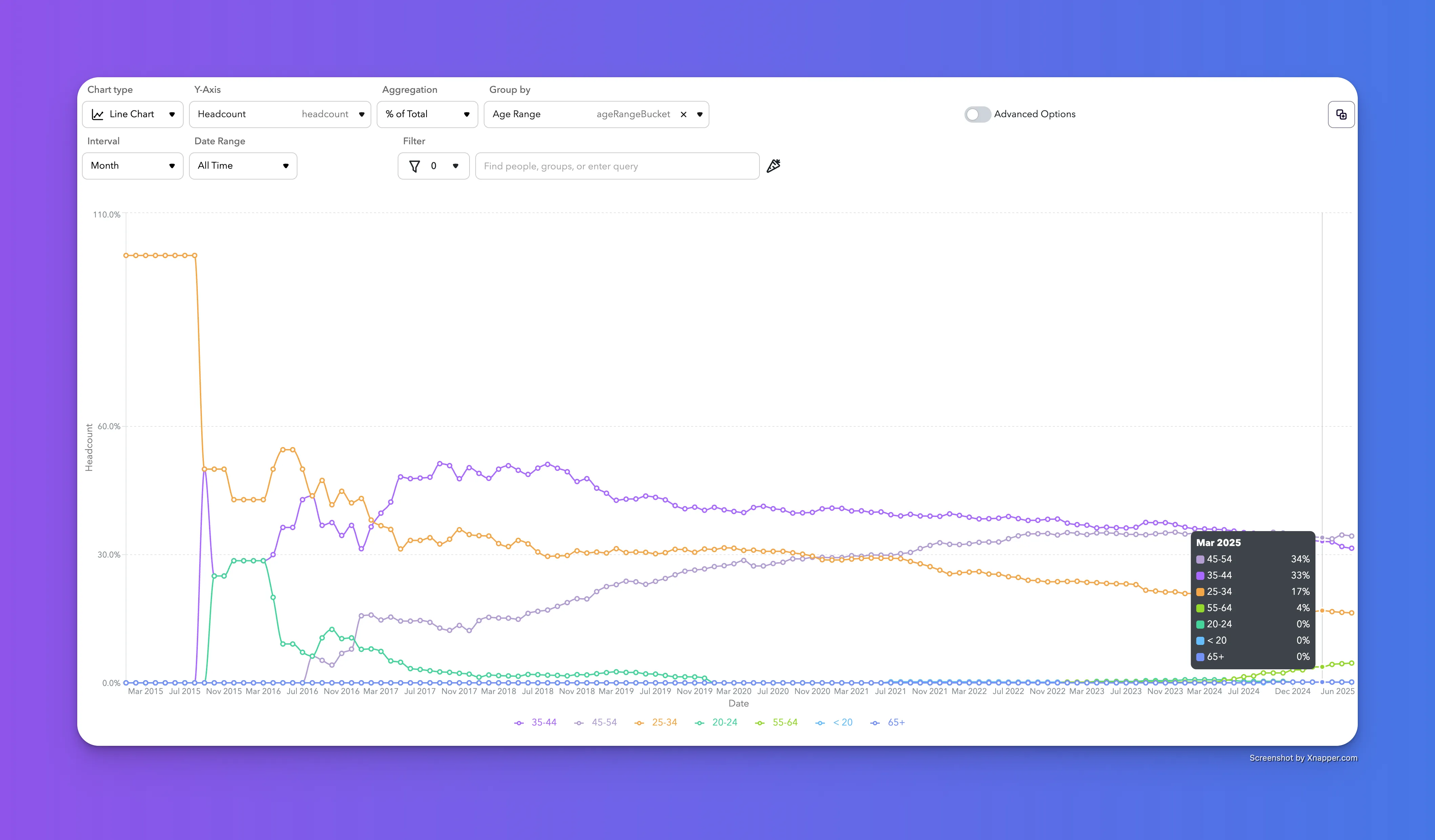
Line charts are perfect for showing trends over time. They connect data points with a continuous line, making it easy to spot changes, patterns, and comparisons across one or more metrics.
Stacked Chart
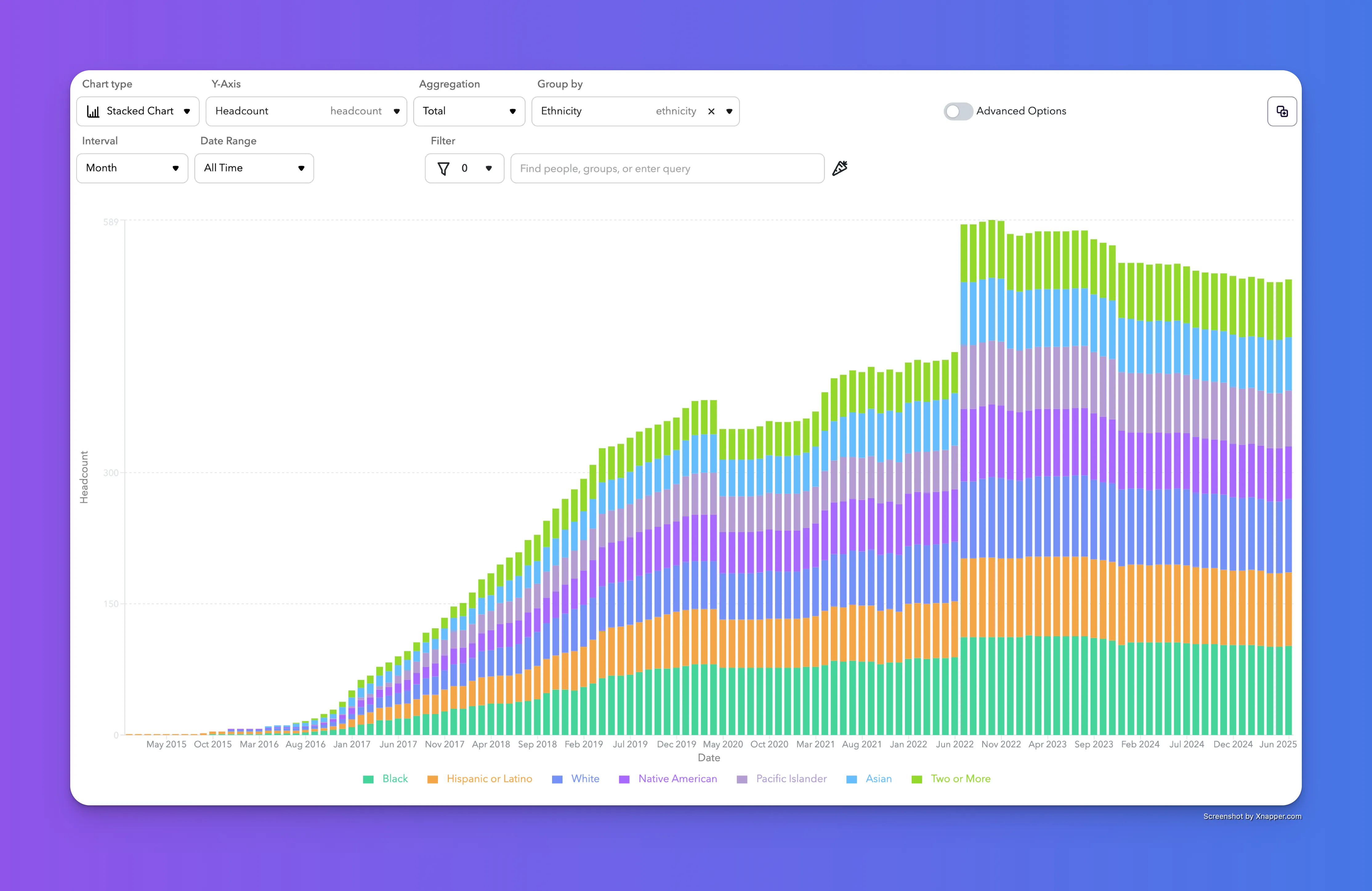
Stacked charts break down totals over time by category, letting you see both overall trends and how individual segments contribute. They’re great for visualizing composition and change across multiple groups in a single view.
Table
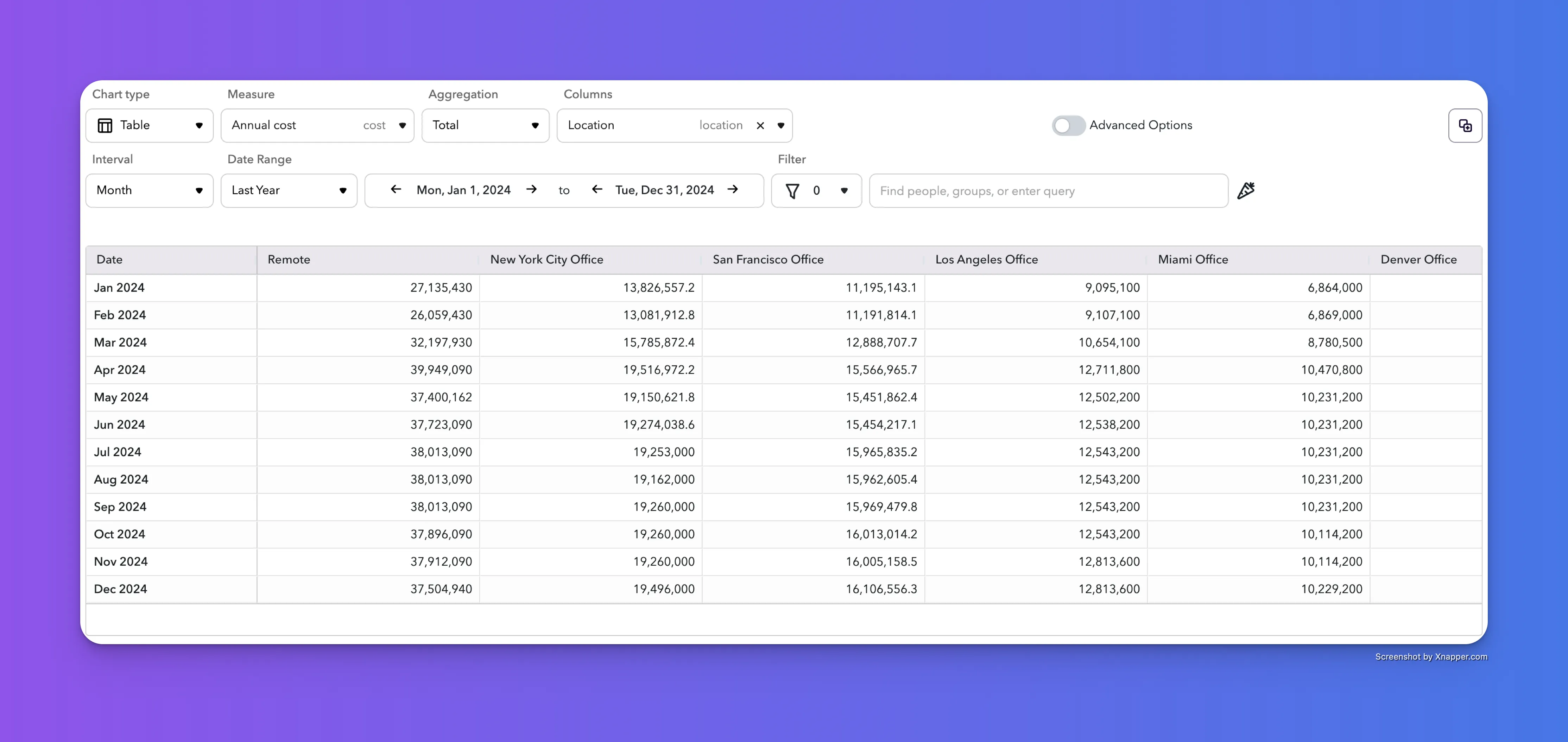
Tables present your data in a clear, structured format—ideal for viewing exact values, comparing details across rows and columns, and exporting for deeper analysis. Best used when precision matters.
Non-Timeseries Chart Types
New! Bubble Chart
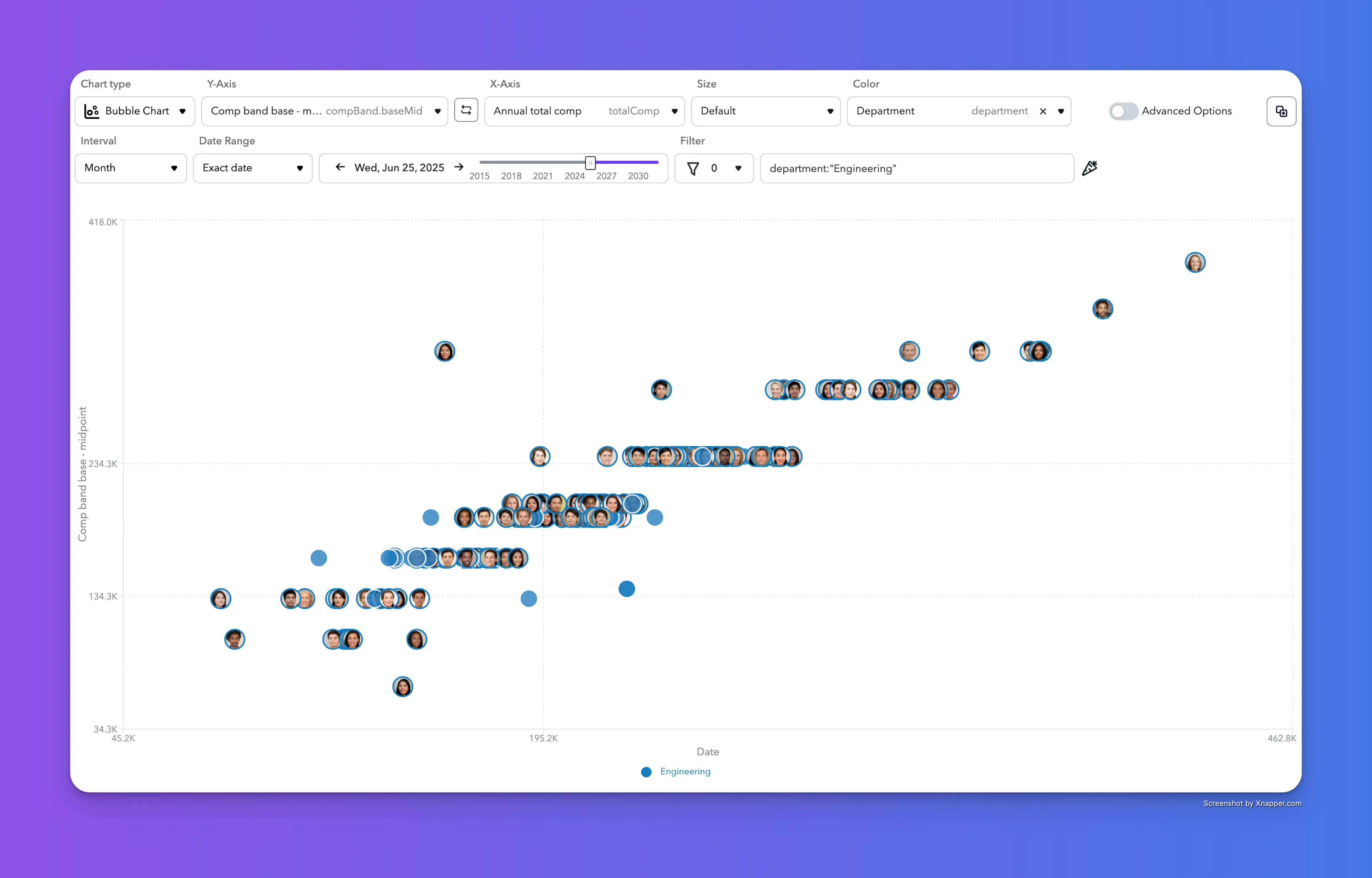
Bubble Chart is a new chart type introduced with Data Explorer. Bubble charts let you compare people across three data points at once—using the X and Y axes for two variables, and bubble size to represent a third. They're great for visualizing relationships, spotting outliers, and understanding distribution across categories enabled with the color option.
Horizontal Bar Chart
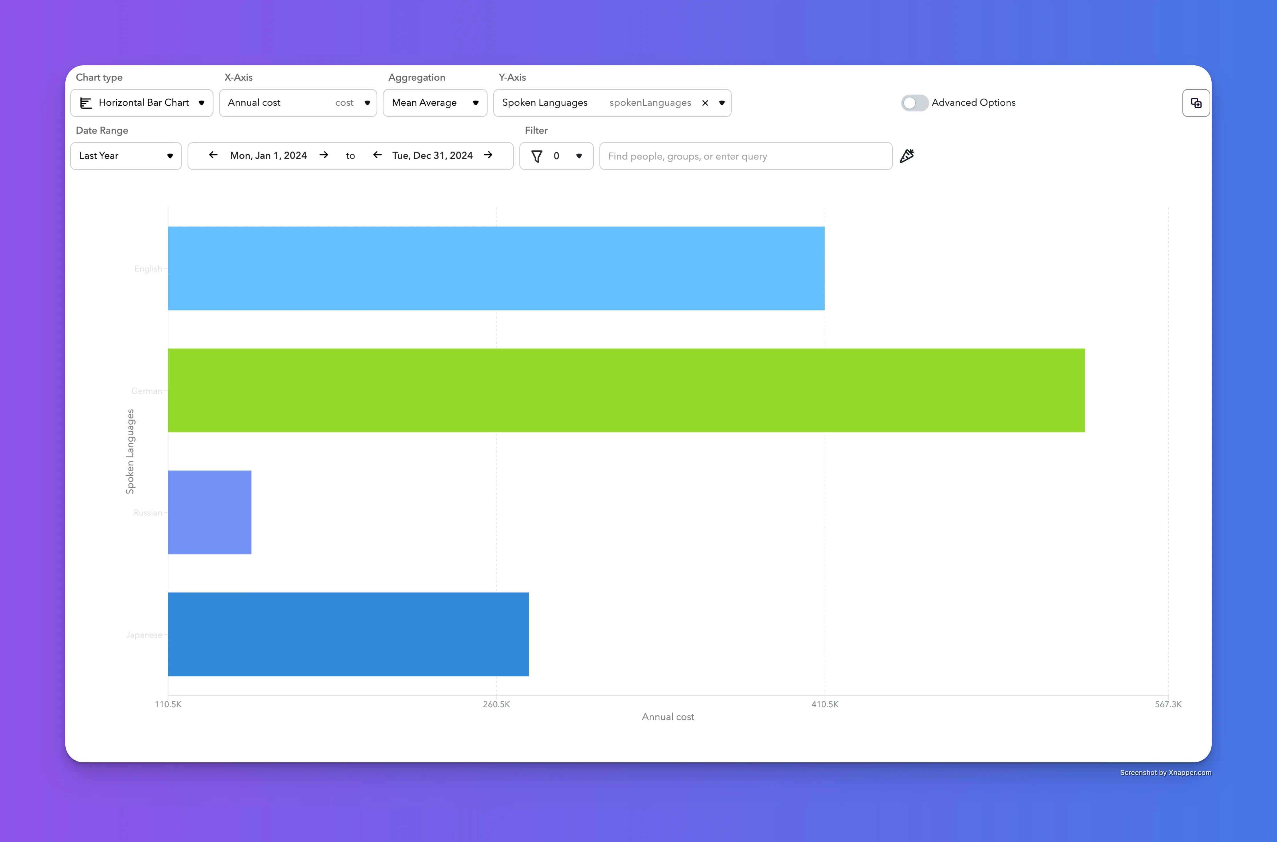
Bar charts make it easy to compare values across categories. Each bar represents a data point, so you can quickly spot differences, rank items, and highlight trends across groups.
Pie Chart
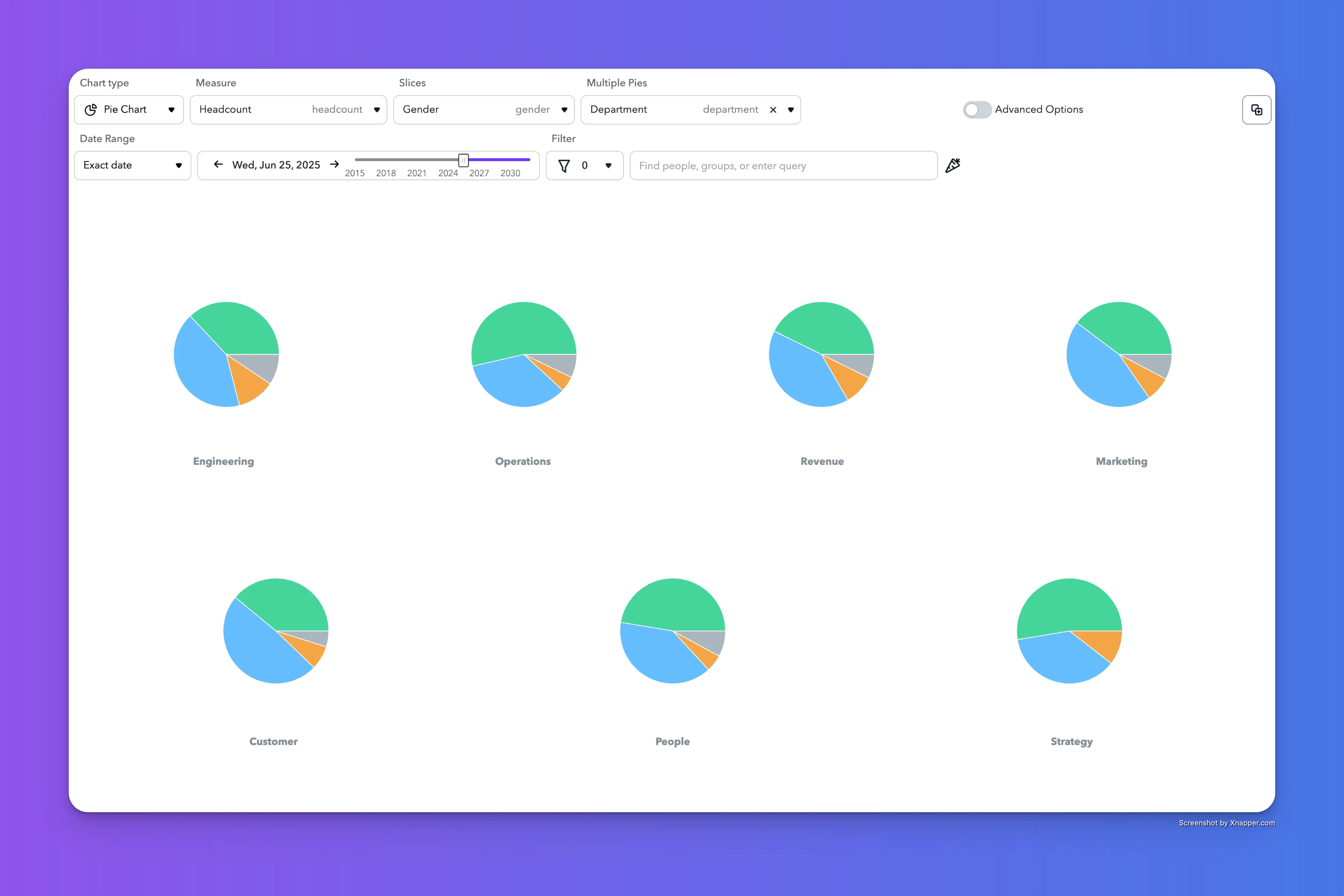
Pie charts show how a whole is divided into parts. Each slice represents a category’s share, making it easy to visualize proportions at a glance. Multiple pie charts let you compare part-to-whole relationships across different groups. They’re useful when you want to see how proportions shift between segments over time or across categories.
Single Metric
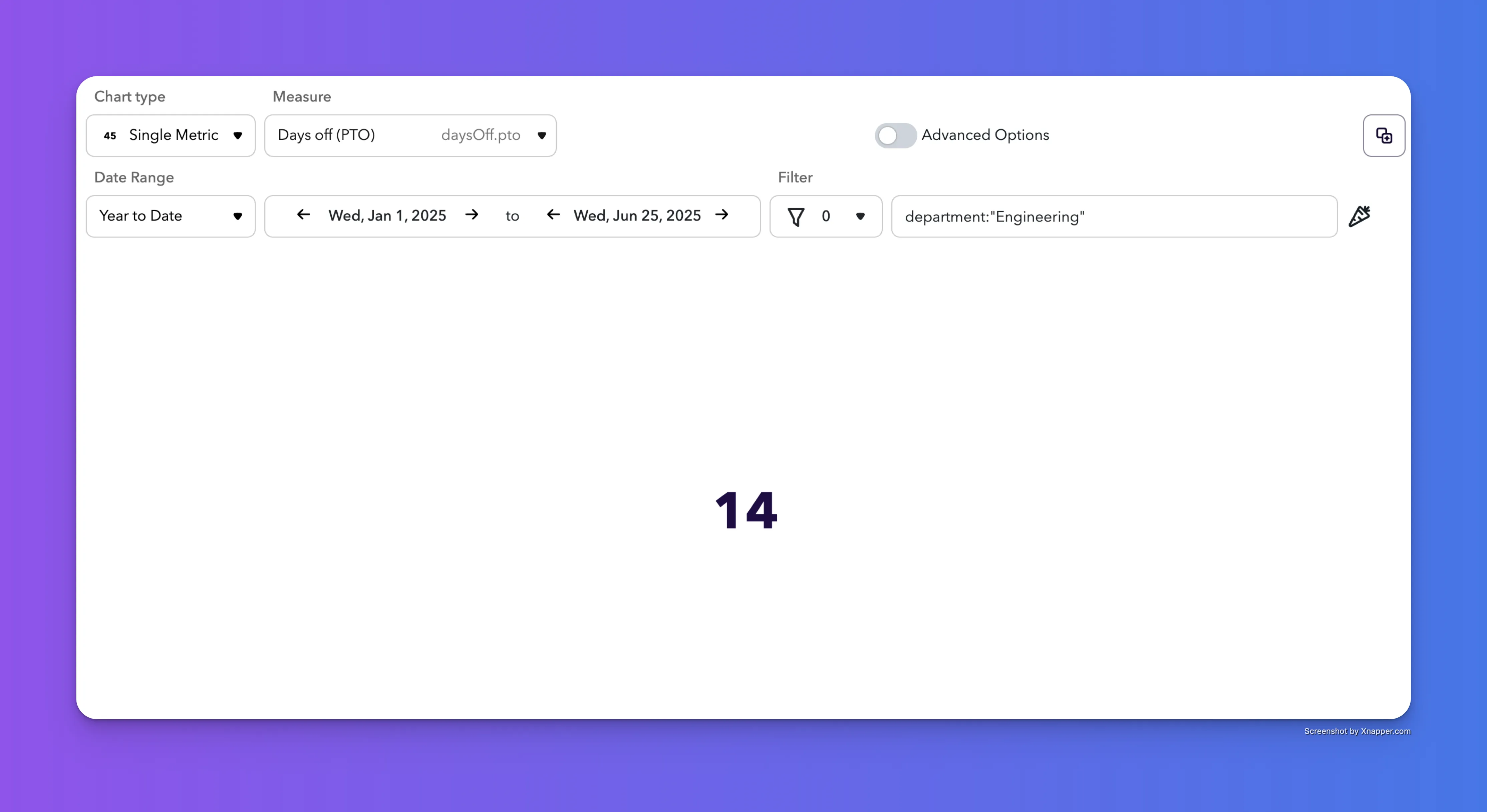
Single metrics highlight one key number—fast. They’re great for calling out totals, KPIs, or any standout value you want to keep front and center.
Table Crosstab
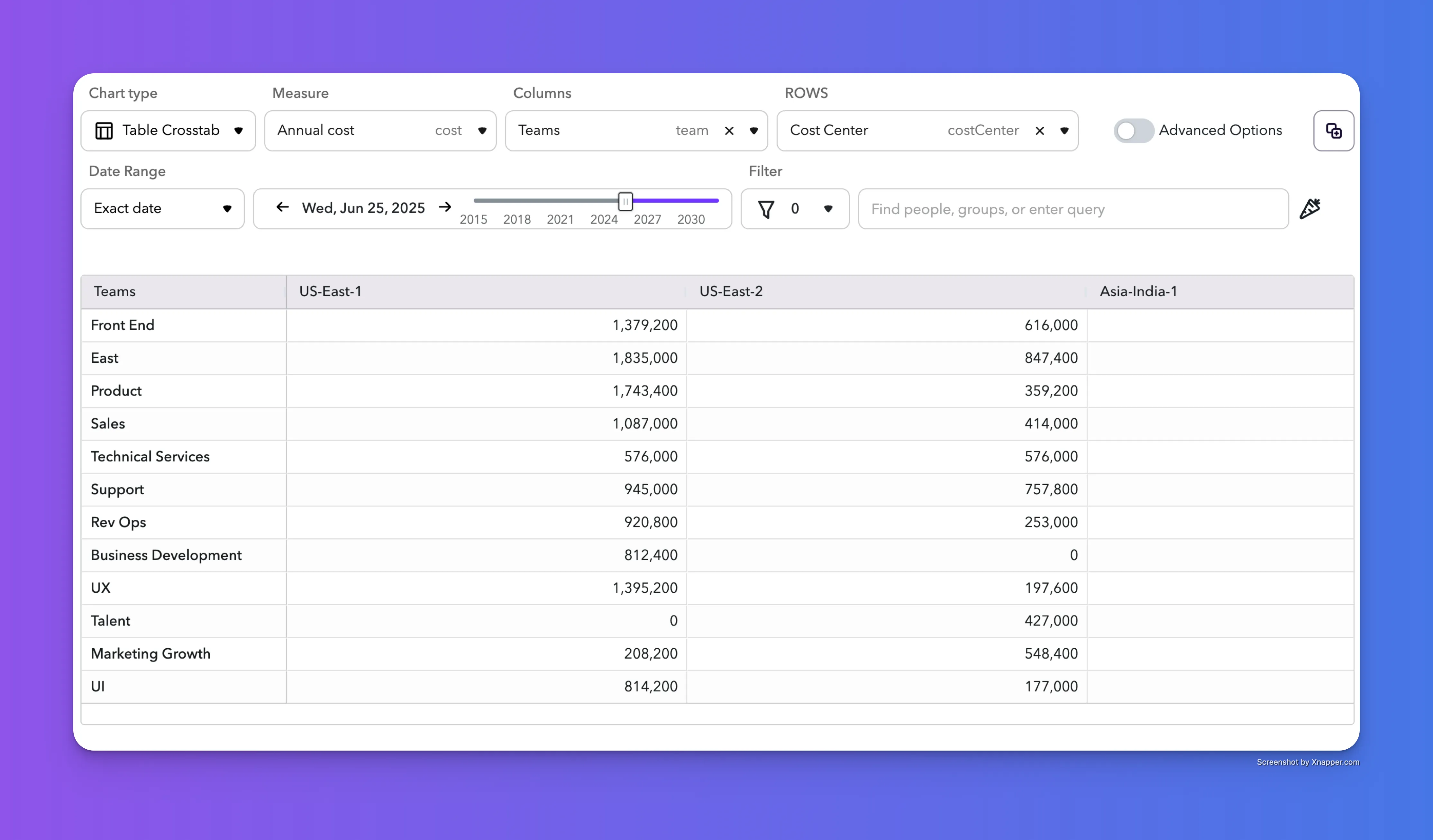
Crosstab tables let you break down data by two dimensions to quickly compare values across categories. Ideal for spotting patterns, drilling into totals, and answering "where" and "who" questions in your data.
Vertical Bar Chart
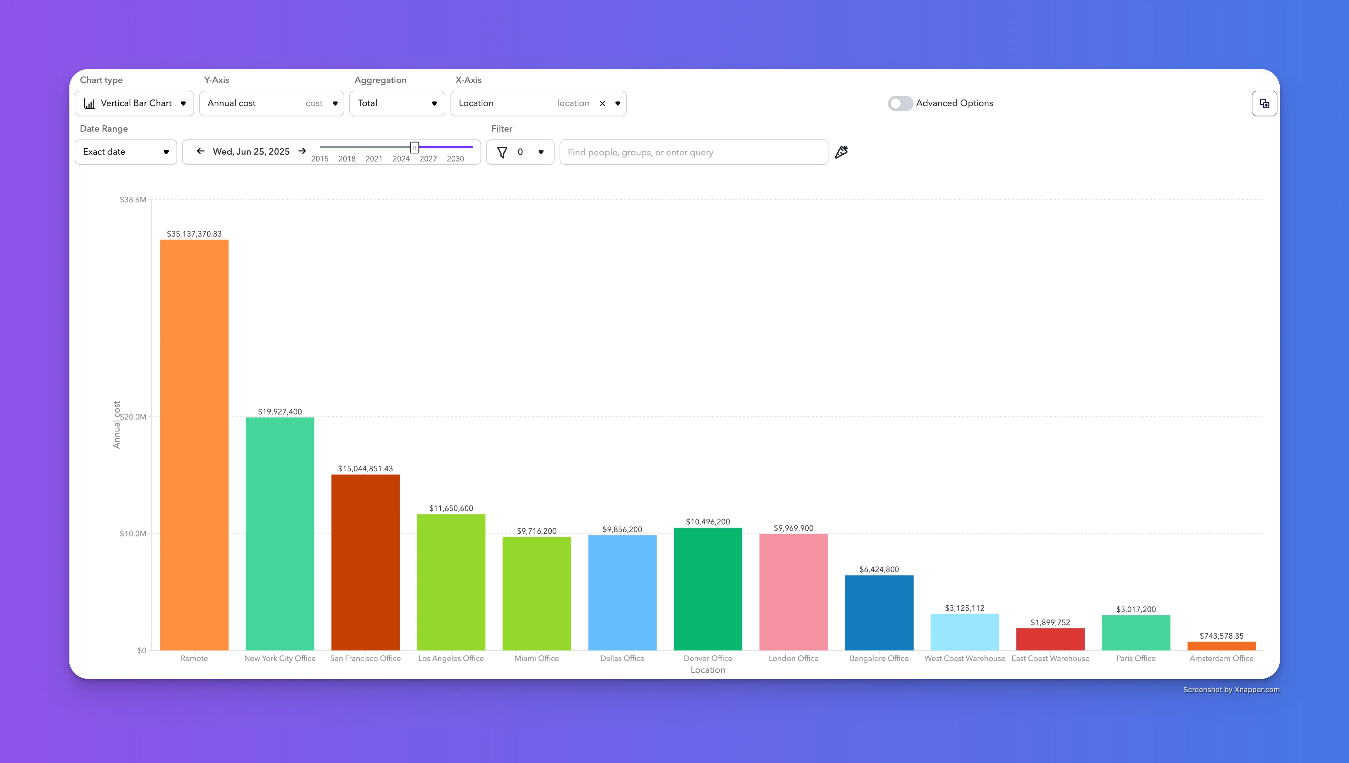
Vertical bar charts make it easy to compare values across categories using columns. They’re great for showing differences, ranking items, and visualizing changes over time or across groups.
Additional Features
Date Range enables you to choose from a multiple of data options.
Time Slider (for Non-Timeseries) lets you move along the timeline of the organization to see the chart at different points in time.
Filter give you access to ChartHop's powerful filtering capabilities including the ability to filter using ChartHop's Carrot Query Language aka CQL.
Advanced Options introduces the ability to create the chart with a Carrot Expression as well as providing access to additional options based on the chart type.
Copy to Dashboard button lets you take the current chart and configuration and add it to a Dashboard.